The look of your site
Colours and style
Changing the visual style of your site and choosing its colour palette.
In this article
Two settings control the look of your site: the style (how things are drawn) and the colours.
They live in Websites → Site settings, right at the top.
The visual style (Design)
Two styles are offered:
- Nature — warm and natural, soft shapes, rounded typeface.
- Modern — professional and clean, straight lines, sober typeface.
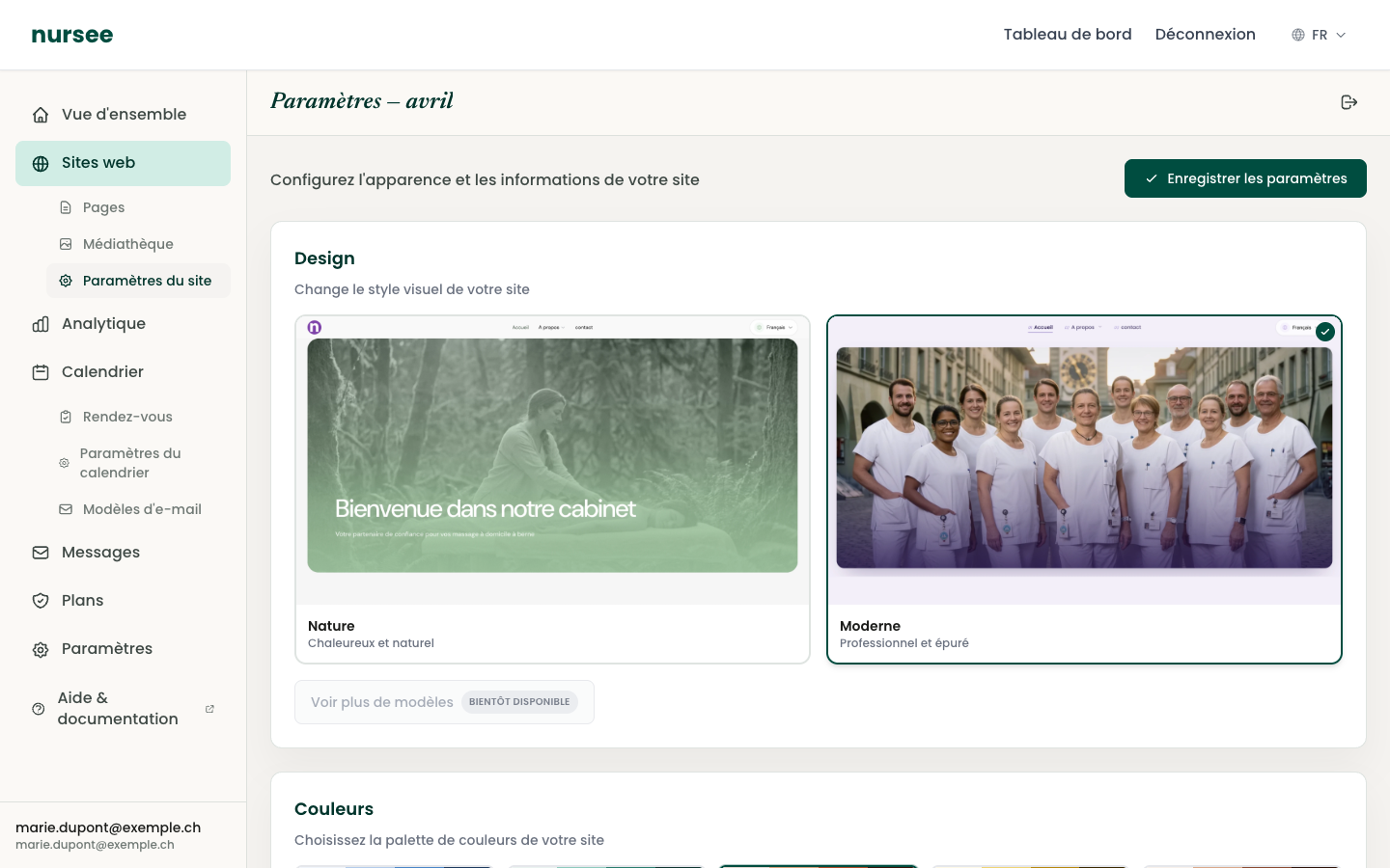
Click the thumbnail of the style you like. A green tick appears on it.
Click « Save settings », at the top right.
Open your site in another tab to see the result.
The style changes the typefaces, the rounded corners, the spacing and the way blocks are drawn. Everything else is identical.
The colours (palette)
Just below, the « Colours » section offers a set of ready-made palettes.
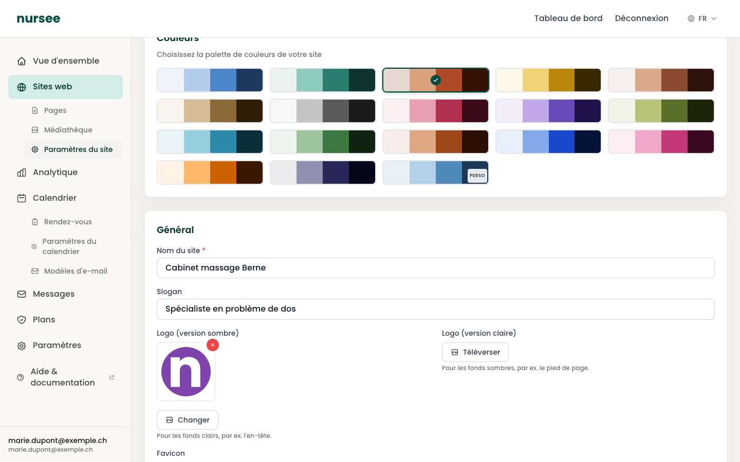
Each rectangle is a palette. It is cut into four bands which represent, from left to right:
the section background — the base colour of the pages;
the brand colour — buttons, footer, links;
the accent colour — details, highlights;
text and headings — the colour of the words.
To change palette:
Click the palette you want. A green tick appears.
Click « Save settings ».
The custom palette
The last palette in the list carries a CUSTOM badge. Choose it if you want to set the four colours yourself — for instance to match your logo exactly.
Four fields then appear, in the same order as the bands:
| Field | What it colours |
|---|---|
| Section background | The background of the pages. Choose a very light colour. |
| Brand colour (primary) | Buttons and the footer. This is your signature colour. |
| Accent colour | Details and active elements. |
| Text & headings | The words. Choose a very dark colour. |
For each field you can either click the colour square (your system's colour picker opens) or type a hex code of the form #rrggbb, for instance #004d40.
The most important advice: contrast
The simple rule: background very light, text very dark. Keep bright colours for the buttons, where they catch the eye without hindering reading.
Checking the result
After saving:
Open your site in a new tab (« Visit » button from Websites → Pages).
Look at your home page.
Take out your phone and open your site on it. That is the real test.
If something does not appeal, come back and change palette. There is no limit to the number of attempts.