The look of your site
Name, tagline, logo and favicon
The identity details of your site, in the site settings.
In this article
These settings define the identity of your site: what appears in the header, in the footer and in the browser tab.
They all live in the same place: Websites → Site settings, « General » section.
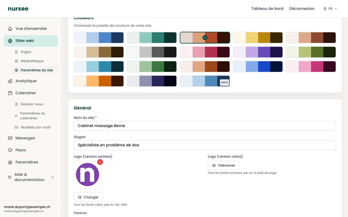
Site name
The name of your practice. It appears in the header (if you have no logo), in the footer and in the browser tab.
It is the only required field on the page — it is marked with a red star.
Examples: Care Plus, Station Road Nursing Practice, Marie Dupont — Osteopath.
Tagline
A short sentence that completes the name. It appears in certain places on the site and gives context.
Examples: Caring for you, at home, Specialist in back problems, Your health, at home.
Keep it under ten words. A tagline you cannot read at a glance is not a tagline.
The two logos
There are two logo fields, and that is deliberate:
| Field | To be used on | Colour of the logo |
|---|---|---|
| Logo (dark version) | Light backgrounds, such as the header | Dark |
| Logo (light version) | Dark backgrounds, such as the footer | Light, usually white |
A dark logo on a dark footer is invisible. Hence the two versions.
Importing a logo
Click « Upload » (or « Change » if a logo is already in place).
Choose the file on your computer.
Click « Save settings ».
Which file to use
- PNG with a transparent background, ideally. The logo then sits perfectly on any colour behind it.
- SVG if your designer supplied one: that is the best choice, sharp at every size.
- Avoid JPG: that format has no transparency, so your logo will have a white rectangle around it.
The favicon
The favicon is the tiny icon in the browser tab, to the left of the page title. It is also what appears when someone bookmarks your site.
Click « Upload » under « Favicon ».
Choose your file.
Click « Save settings ».
Which file to use
- A square image — the same width as height. A rectangular one will be squashed.
- Format PNG, SVG or ICO.
- Suggested size: 512 × 512 pixels. Larger is pointless.
- A very simple design: a letter, a symbol. At the size it appears (about 16 pixels), a detailed logo becomes an unreadable smudge.